Retail shelves have turned brutal. Shoppers walk past dozens of products in seconds, and most never get a second glance. The ones that do get touched, picked up, turned around, and tossed into baskets share something in common, and it usually has nothing to do with the product inside. It comes down to whether the packaging actually earns the desired look.
When Plain Packaging Quietly Kills Sales
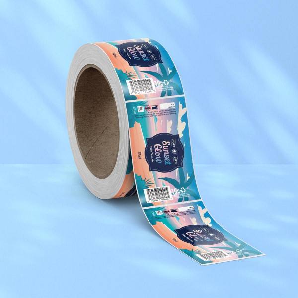
Shelf Invisibility Is Real: This is where custom sticker labels start doing the heavy lifting. Generic packaging tends to disappear into the background, even when the product itself is genuinely good. Customisation gives small brands a fighting chance against bigger competitors with deeper marketing budgets and stronger name recognition built up over years.
Personality Has To Show Up Fast: A label has roughly three seconds to communicate who you are, what you make, and why anyone should care. Personalised wine label designs handle this beautifully because they balance heritage cues with personal storytelling, something mass-produced bottles cannot really pull off. Small wineries lean into this advantage often, and it tends to pay off.
The Quiet Power of Material Choices
Touch Matters More Than People Think: Texture changes everything. Uncoated paper stock signals craft and care, while smoother finishes lean polished and modern. Shoppers run their thumbs across a bottle without even thinking about it, and that small moment shapes how premium the product feels before they have read a single word on the front.
Finish Sets The Mood: Matte laminates calm a label down, giving it that understated, considered look. Gloss does the opposite, pushing colours forward and catching light from across an aisle. Neither is wrong, perhaps, but each sends a different signal, and the right choice depends entirely on the type of buyer the product is hoping to reach.
Designs That Earn A Second Glance
Some details work harder than others when it comes to pulling someone in. Worth paying attention to:
- Strong contrast between background and main typography
- A focal point the eye lands on within the first second
- White space that lets important information breathe
- Colour palettes that match the product’s actual personality
- Print effects like synthetic silver stock for selective shine
Why Storytelling Beats Slogans
Small Details Carry Big Meaning: A founder’s name, a regional postcode, a hand-drawn illustration of the brewery dog. These tiny touches feel personal because they are. Buyers notice, and more importantly, they remember. That kind of recall is the thing that turns a one-off purchase into someone genuinely becoming a fan of the brand.
Authenticity Cannot Be Faked: Trying too hard usually shows. Labels that feel forced or overly slick can actually push buyers away, especially in categories where authenticity is part of the appeal. Craft drinks, natural skincare, artisan foods, all of these rely on packaging that feels honest rather than corporate, and shoppers can spot the difference instantly.
Watching A Product Earn Its Place
Walk into any independent bottle shop or boutique grocer and the pattern repeats itself. The products getting picked up have labels that look like someone genuinely cared. They are not perfect, and they do not need to be. They just need to feel intentional, considered, and a little bit different from everything else on the shelf. Ready to give your product the label it actually deserves? Request a quote today and start turning passing glances into purchases.
Featured Image Source: https://docs.google.com/document/d/1B1we47ALZqrGqc1enzOzbbQjUQvrjMQ9AP199V0Gb8E/edit?usp=drive_link