Your label is the handshake before anyone tastes your product. It’s the silent salesperson working 24/7 on the shelf. And here’s the uncomfortable bit: if your label looks like an afterthought, customers assume what’s inside got the same treatment. Small brands especially can’t afford that risk. Your packaging is often competing against giants with massive marketing budgets, so every detail counts.
When Your Label Becomes Your Brand Voice
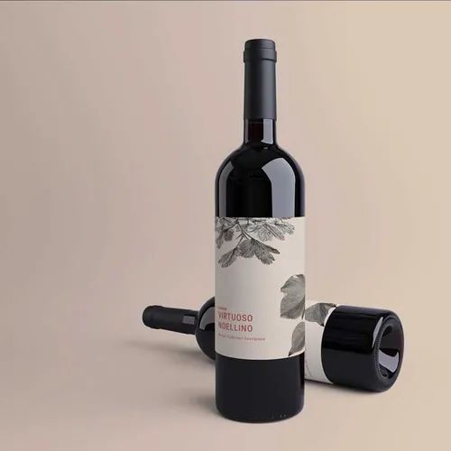
First Impressions That Stick: Wine labels printing creates that crucial visual identity customers remember long after they’ve left the shop. A craft winery’s label isn’t just telling people what grape variety is inside. It’s whispering promises about quality, care, and the story behind every bottle. The texture of the paper, the weight of the material, even the finish choice sends signals about what kind of experience awaits. People judge quality by what they can see and touch first.
Making It Yours Matters More Than You Think: Here’s where custom label printing stops being a luxury and becomes essential. Generic templates scream “budget brand” even if what’s inside the bottle or jar is brilliant. Customers can spot cookie-cutter designs from across the aisle. Custom work lets small brands punch above their weight class. It tells buyers this product deserves shelf space next to the big names because someone cared enough to get the details right.
The Emotional Pull Nobody Talks About
Design That Triggers Memory: Think about the last product you grabbed purely because the label caught your eye. Maybe it reminded you of something nostalgic. Perhaps the colours just felt right for your mood that day. Labels work on an emotional level most business owners underestimate. Colour psychology plays a sneaky role here. Warm tones can make food products feel homemade and comforting. Cool blues and greens signal freshness or natural ingredients without saying a word.
Building Trust Through Touch: There’s something about substrate selection that changes how premium a product feels. Glossy finishes pop under shop lighting and feel modern. Matte textures suggest sophistication and craft. Textured papers add that artisan quality customers associate with small-batch care. Your label’s physical feel is doing marketing work before anyone reads a single word on it.
Why Small Brands Need Big Label Energy
Standing Out Isn’t Optional Anymore: Shelf space is brutal. Supermarkets and bottle shops are packed with choices. Your label has maybe three seconds to stop someone mid-scroll through the aisle. That’s not enough time for clever copy or detailed ingredient lists. It’s pure visual impact. The brands that win are the ones treating their labels like the marketing investment they actually are.
Consistency Builds Recognition: Here’s what separates forgettable brands from the ones people actively search for. Repeating design elements across your product range creates visual shortcuts in customer brains. They start recognising your style before they even read your brand name. Same colour palette, similar typography, consistent finishing choices. It’s how tiny breweries build cult followings and how homemade jam makers turn into regional favourites.
The Real Cost of Cheap Labels
When Savings Backfire Spectacularly: Plenty of small brands try cutting corners on label quality. The logic seems sound at first. Why spend extra when you’re just starting out? But here’s what happens: labels that smudge, peel, or fade make your entire brand look unreliable. Customers don’t separate packaging quality from product quality in their heads. A tatty label suggests tatty contents, even when that’s completely unfair.
Investment That Pays Back: Professional label work isn’t an expense. It’s customer acquisition in disguise. Better materials mean your bottles still look sharp after sitting in ice buckets or chiller cabinets. Proper printing means colours stay true under harsh shop lighting. These details keep your brand looking intentional and premium, even when you’re competing against corporations with design teams.
Making Your Labels Work Harder
Beyond Pretty Pictures: Great labels multitask. They’re catching eyes, communicating quality, meeting legal requirements, and surviving real-world conditions. All at once. That’s a lot to ask from one piece of printed material. Smart brands think about where their products actually live. Will they be refrigerated? Handled with wet hands? Shipped long distances? The label needs to handle whatever gets thrown at it.
Practical Design Choices That Matter:
- Waterproof materials keep labels looking fresh in coolers and fridges
- UV-resistant inks prevent fading under shop lights or sun exposure
- Strong adhesives mean labels stay put through temperature changes
- Durable finishes protect against scratches and handling wear
What It All Comes Down To
Your label is telling a story whether you planned it that way or not. The only question is whether it’s the story you want customers hearing. Small brands have an advantage here that big companies would kill for. You can be personal, authentic, and quick to adapt. Your labels can reflect real care and attention because you’re genuinely putting that care in. Don’t waste that advantage with labels that look like everyone else’s or fall apart after a week on the shelf. Chat to our team about creating labels that stick around as long as your customers do.
Featured Image Source: https://degqkf7c4iqz7.cloudfront.net/labexonpr/images/opt/products_gallery_images/Premium-Wine-Labels-Merlot-Bottle.jpg.webp?v=7055